
Sections & Widgets
A Creopse page is made of section and widget instances — the two building blocks a template is assembled from. This page covers how to create them, their data structure, and rendering conventions, for both the Vue 3 and React 19 stacks.
Sections vs widgets
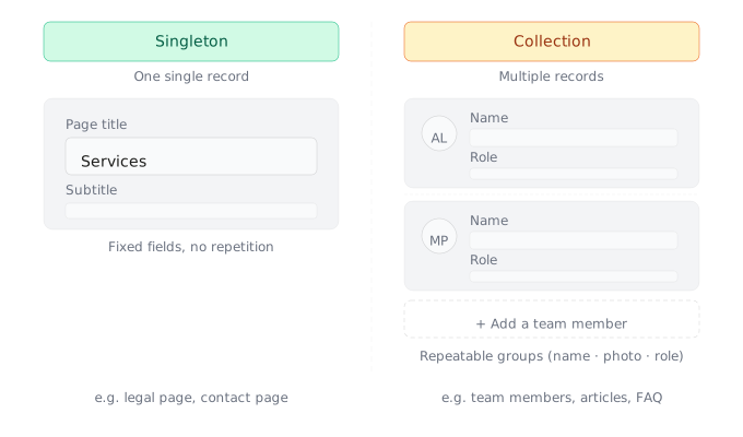
- Section — an editable, translatable UI block managed from the admin panel (Header, Hero, Services, Testimonials, Footer, Contact...). A section has a data structure: singleton fields and, where relevant, collections and display settings.
- Widget — a static HTML block with no content management needs (preloader, scroll progress bar, static cookie banner...). A widget has no data structure: it's pure HTML/Vue (or HTML/React).
Creating a section or widget
Scaffolding happens through the CLI, which generates both the frontend component and its database entry:
creopse section add Header Hero Features Services Testimonials Footer Contact
creopse widget add Preloader ScrollProgress
Each generated section places its component in resources/js/Sections/<SectionName>.vue (.tsx on React), each widget in resources/js/Widgets/<WidgetName>.vue (.tsx on React).
Anatomy of a section
A section is defined by a data structure and, if it has display settings, a settings structure. Both are submitted through creopse section edit:
creopse section edit Header \
  --data-structure @.creopse/sections/Header/data-structure.json \
  --settings-structure @.creopse/sections/Header/settings.json
Data structure
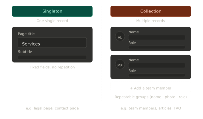
The data-structure.json file holds a two-level object: index for singleton fields, and one key per collection at the root level.
{
  "index": [
    {
      "key": "title",
      "type": "i18n-text",
      "label": "{\"en\":\"Title\",\"fr\":\"Titre\"}",
      "options": [],
      "required": true,
      "settings": {}
    },
    {
      "key": "text",
      "type": "i18n-editor",
      "label": "{\"en\":\"Text\",\"fr\":\"Texte\"}",
      "options": [],
      "required": false,
      "settings": {}
    }
  ],
  "features": {
    "key": "features",
    "title": "{\"en\":\"Features\",\"fr\":\"Caractéristiques\"}",
    "items": [
      {
        "key": "icon",
        "type": "icon",
        "label": "{\"en\":\"Icon\",\"fr\":\"Icône\"}",
        "options": [],
        "required": true,
        "settings": {}
      },
      {
        "key": "title",
        "type": "i18n-text",
        "label": "{\"en\":\"Title\",\"fr\":\"Titre\"}",
        "options": [],
        "required": true,
        "settings": {}
      }
    ]
  }
}
A collection (features above) only makes sense when the number of elements is variable. When the number of sub-elements is fixed (for example two buttons per slide), prefer flat singleton fields (btnOneLabel/btnOneUrl/btnTwoLabel/btnTwoUrl) over a collection.
Field types
| Type | Usage |
|---|---|
text | Non-translatable string: URL, proper name, technical value. |
i18n-text | Short translatable string (title, label, tagline). |
textarea | Non-translatable text area (rare). |
editor | Non-translatable rich editor (rare). |
i18n-editor | Translatable rich editor — the canonical type for any description field. |
number | Numeric value. |
checkbox, switch, slider, range-slider | Numeric/boolean fields. |
single-select, multi-select | Selection fields. |
date, daterange, datetime, datetimerange, year, yearrange, month, monthrange, quarter, quarterrange, week | Date fields. |
image, gallery, audio, video, document, file | Media fields. |
news-article, news-articles, news-category, news-categories, news-tag, news-tags | References to native news content. |
icon, icons, color, gradient | Icon(s) and color(s). |
content-model-item | Reference to an item of a content model (e.g. a parent service). |
content-model-items | Reference to several items of a content model. |
menu-item-link | Hybrid link for CTA/navigation buttons: supports both a reference to a menu item (numeric id) and a raw URL. |
list, i18n-list, albums | List fields. |
WARNING
i18n-textarea exists but should never be used — even for short text, if the field holds rich HTML or a substantial description, i18n-editor applies instead.
Choice rules
i18n-textfor any short, unformatted translatable string (titles, labels, taglines, button labels).textfor anything non-translatable: URLs, proper names, technical values.- Visitor-submitted form fields (contact, newsletter): always
text/checkbox, neveri18n-*. menu-item-linkvstextfor a link: if the link should stay manageable from menu management (global navigation consistency, header CTA), usemenu-item-link; if the component uses the value directly as a URL without going through the menu system (self-contained section CTA),textis legitimate.- Never duplicate global data already available through
getAppInformationValue()(site name, contact details, social networks, brand colors...) — see Utilities.
Consuming the data in a component
With a Vue frontend
<script setup lang="ts">
const props = defineProps<SectionProps>()

const { tr, rHtml, fileUrl } = useHelper()
const { getSectionRootData, getSectionData, getSectionSettings } = useContent()

const sectionData = getSectionRootData(props.sectionKey)
const features = getSectionData(props.sectionKey)?.features ?? []
const settings = getSectionSettings(props.sectionKey)
</script>

<template>
  <h2>{{ tr(sectionData?.title) }}</h2>
  <div v-html="rHtml(sectionData?.text)"></div>

  <div v-for="feature in features" :key="feature.key">
    <ContentIcon :data="feature.icon" :size="42" />
    <h3>{{ tr(feature.title) }}</h3>
  </div>
</template>
With a React frontend
const Section: React.FC<SectionProps> = (props) => {
  const { tr, rHtml, fileUrl } = useHelper()
  const { getSectionRootData, getSectionData, getSectionSettings } = useContent()

  const sectionData = getSectionRootData(props.sectionKey)
  const features = getSectionData(props.sectionKey)?.features ?? []
  const settings = getSectionSettings(props.sectionKey)

  return (
    <>
      <h2>{tr(sectionData?.title)}</h2>
      <div dangerouslySetInnerHTML={{ __html: rHtml(sectionData?.text) }} />

      {features.map((feature) => (
        <div key={feature.key}>
          <ContentIcon data={feature.icon} size={42} />
          <h3>{tr(feature.title)}</h3>
        </div>
      ))}
    </>
  )
}
tr(field) translates an i18n-text field, rHtml(field) renders the HTML of an i18n-editor field (always through v-html/dangerouslySetInnerHTML, never interpolated as plain text), fileUrl(field) resolves the absolute URL of a media field. See Utilities for the full list of available composables/hooks.
Conditional rendering
When a pair of fields must both be filled in to be displayed (typically a button with a label + URL):
<a v-if="data?.btnUrl && tr(data?.btnText)" :href="data.btnUrl">{{ tr(data.btnText) }}</a>{data?.btnUrl && tr(data?.btnText) && (
<a href={data.btnUrl}>{tr(data.btnText)}</a>
)}Links and CTA buttons
For a menu-item-link field, the href is resolved through getLinkFromMenuItemId(field) and navigation goes through openLink(field), rather than the link's native behavior — this handles both possible cases (menu id or raw URL) uniformly:
<a
  v-if="slide.btnUrl && tr(slide.btnLabel)"
  :href="getLinkFromMenuItemId(slide.btnUrl)"
  @click.prevent="openLink(slide.btnUrl)">
  {{ tr(slide.btnLabel) }}
</a>
Any link coming directly from the menu system (main menu item, submenu, location-based list) follows the same cross-cutting pattern, with getMenuHref/openMenu:
<a :href="getMenuHref(item)" @click.prevent="openMenu(item)">{{ tr(item.title) }}</a>Never a hardcoded href or direct navigation on a menu link or a menu-item-link CTA. See Menus for setting up the locations/menus/items consumed here.
Interactive behaviors
A static template's source HTML often relies on JS plugins (Bootstrap, Swiper, lightbox...) — these behaviors must be reimplemented natively rather than kept as-is:
- Hand-rolled carousels/sliders (a full-screen hero with overlay, for example): local state +
setIntervalstarted/cleared on component mount/unmount, never a third-party JS plugin for this case. - Swiper: always through the framework's official binding (
swiper/vueorswiper/react), never the source template's vanillaswiper-container/swiper-slidemarkup. - Modals:
Teleport/MountedTeleport+ local state, never a functionaldata-bs-toggle="modal". - Accordions (FAQ, detailed content): state = open index, never a functional
data-bs-toggle="collapse". - Animated counters: triggered once through an intersection observer (
IntersectionObserver), not on page load.
WARNING
No plugin JS script (Bootstrap, carousels, modals, accordions) should remain functional in a final component — the attribute can stay for CSS styling, but the behavior must be entirely carried by the framework.
Widgets
A widget follows the same creation and HTML adaptation steps as a section, but with no data structure and no fake data — it's a purely static component. It therefore does not expose a sectionKey consumable through useContent().
Bilingualism
Every section component (and its fake data) is bilingual FR/EN by default, even if the source HTML template provided only exists in a single language.